POS主屏幕
基于odoo18.0
产品屏幕
产品屏幕(Product Screen) 是POS中用来选择产品和进行价格和数量选择的组件。
产品屏幕结构
我们先来看一下产品屏幕的布局结构组成:
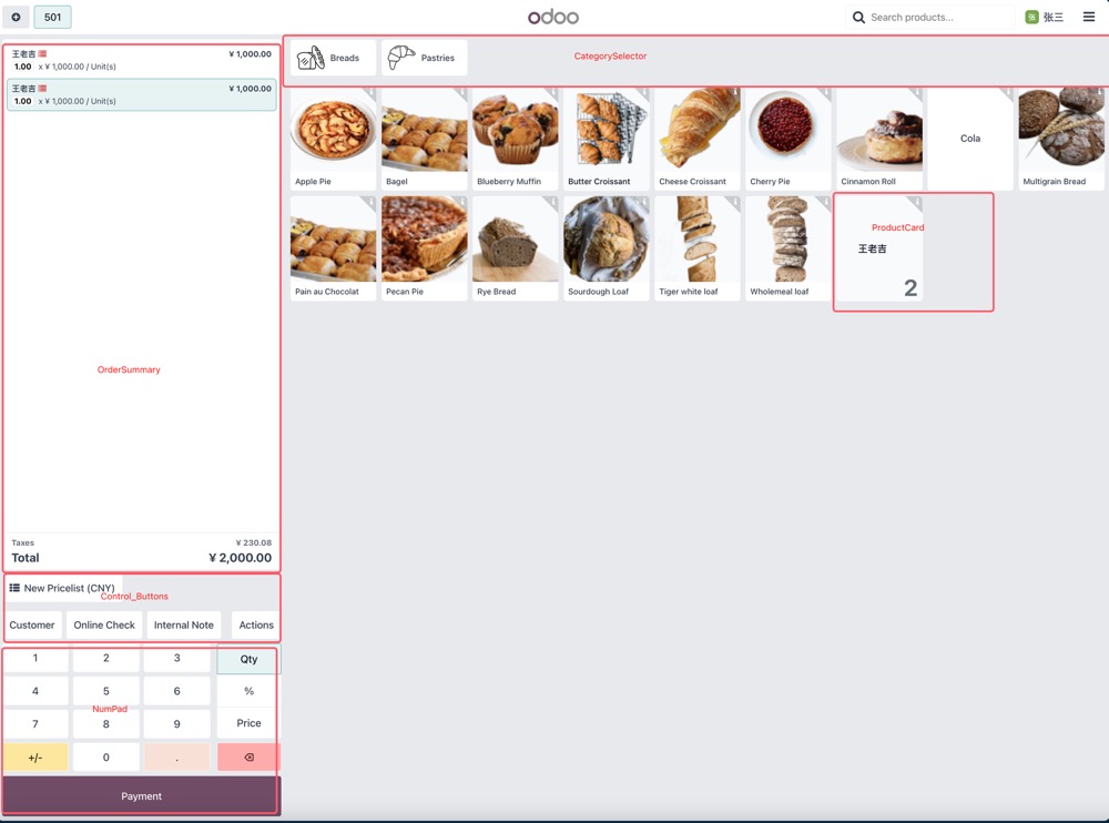
- OrderSummary: 订单汇总组件
- Control_Buttons: 控制按钮组件
- NumPad: 数字键盘组件
- CategorySelector: 分类选择组件
- ProductCard:产品信息卡组件
控制按钮(Control_Buttons)
控制按钮用来在产品屏幕进行选择客户、填写备注等动作使用。控制按钮是使用组件ControlButtons。
自定义控制按钮
首先,我们我定义自己的控制按钮视图:
 <?xml version="1.0" encoding="utf-8"?>
 <templates id="template" xml:space="preserve">
     <t t-name="hhg_pos.MFDOrderButton">
         <button t-att-class="buttonClass" t-on-click="onClick">
             MFD Order
         </button>
     </t>
 </templates>
这里定义了一个QWeb模板,里面添加一个按钮,并绑定了事件onClick。
接下来,我们来定义我们的按钮逻辑:
 import { Component, useState } from '@odoo/owl';
 import { usePos } from '@point_of_sale/app/store/pos_hook';
 import { useService } from '@web/core/utils/hooks';

 export class MFDOrderButton extends Component {
     static template = 'hhg_pos.MFDOrderButton';
     static props = {
         icon: { type: String, optional: true },
         label: { type: String, optional: true },
     };
     static defaultProps = {
         label: 'MFD Order',
     };
     setup() {
         this.pos = usePos();
         this.dialog = useService("dialog");
         this.orm = useService("orm");
     }

     get buttonClass() {
         return `btn btn-light btn-lg lh-lg ${this.state.isActive ? 'active' : ''} flex-shrink-0`;
     }

     async onClick() {
         //OnClick 事件处理
         ...
     }
 }
然后,我们将我们自定义的按钮添加到控制按钮组中:
 import { MFDOrderButton } from "@hhg_pos/js/product_screen/mfd/ mfd_orderbutton";
 import { ControlButtons } from "@point_of_sale/app/screens/product_screen/control_buttons/control_buttons";
 import { patch } from '@web/core/utils/patch';

 patch(ControlButtons, {
     components: {
         ...ControlButtons.components,
         MFDOrderButton,
     }
 });
这里我们通过patch组件,将我们自定义的组件添加到ControlButons的组件列表中,以便odoo在加载POS产品屏幕时会自动将我们的按钮添加进去。
最后,我们将我们的按钮添加到视图中。
 <?xml version="1.0" encoding="utf-8"?>
 <templates>
     <t t-name="ControlButtons" t-inherit="point_of_sale.ControlButtons" t-inherit-mode="extension">
         <xpath expr="//SelectPartnerButton" position="after">
             <MFDOrderButton />
         </xpath>
     </t>
 </templates>
这样我们就完成了一个自定义控制按钮的添加工作。